Updated on February 24, 2026
6 Reasons Why Visual Design Matters for Resume Success
See why visual design matters for resume success and how layout, hierarchy, and readability can directly influence the hiring manager’s impression.

Novorésumé got people hired at
Your resume’s design can make or break your job chances – no matter how strong your experience is.
Most job seekers obsess over wording but ignore layout, ending up with cluttered, inconsistent documents that turn recruiters off in seconds.
The truth? Visual design matters for resume success.
Clean formatting, consistent spacing, and modern structure make your skills pop and your application memorable. Here’s why design isn’t just decoration, it’s your first impression.
Let's break down exactly why design matters and how to get it right!
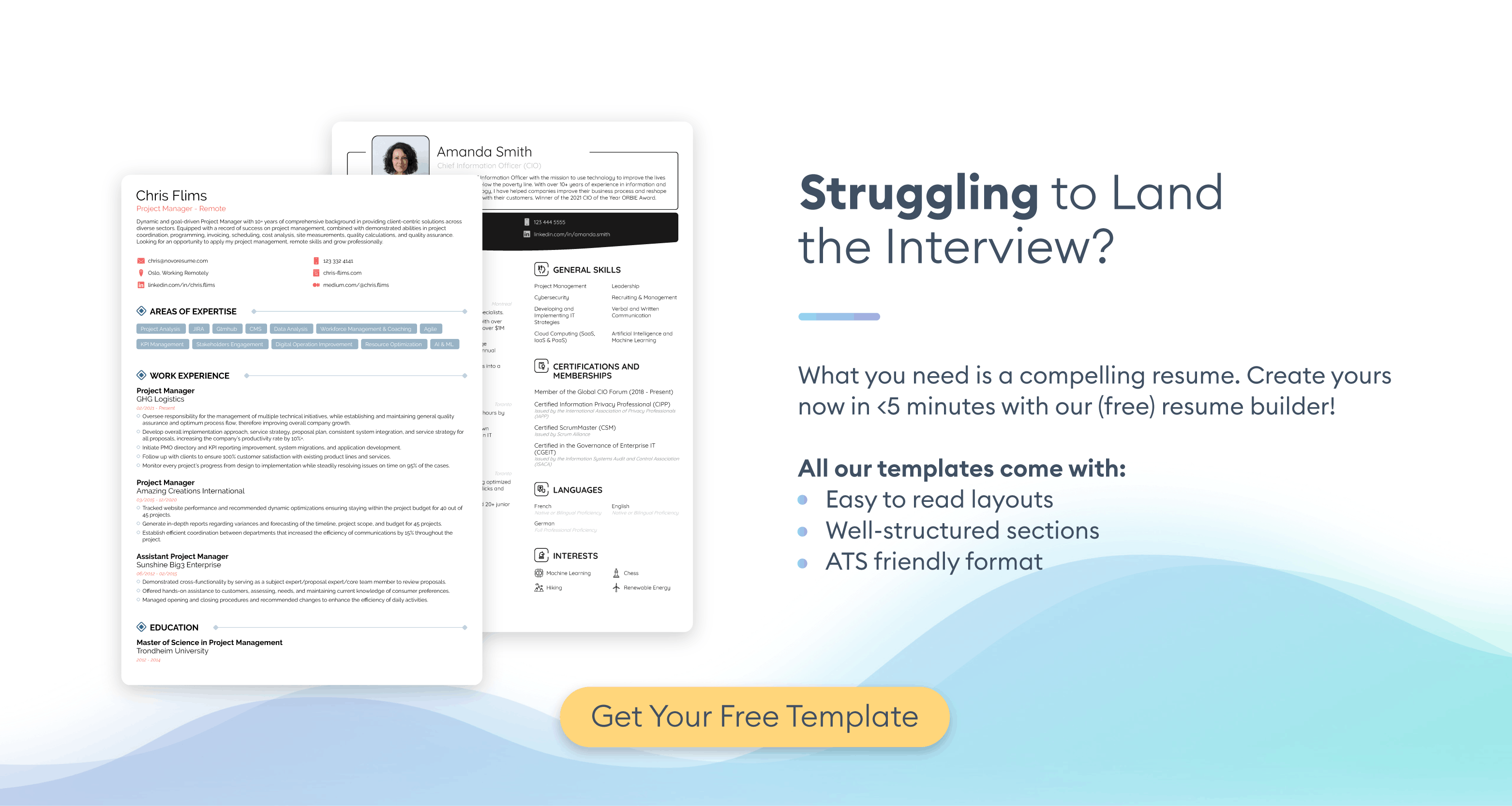
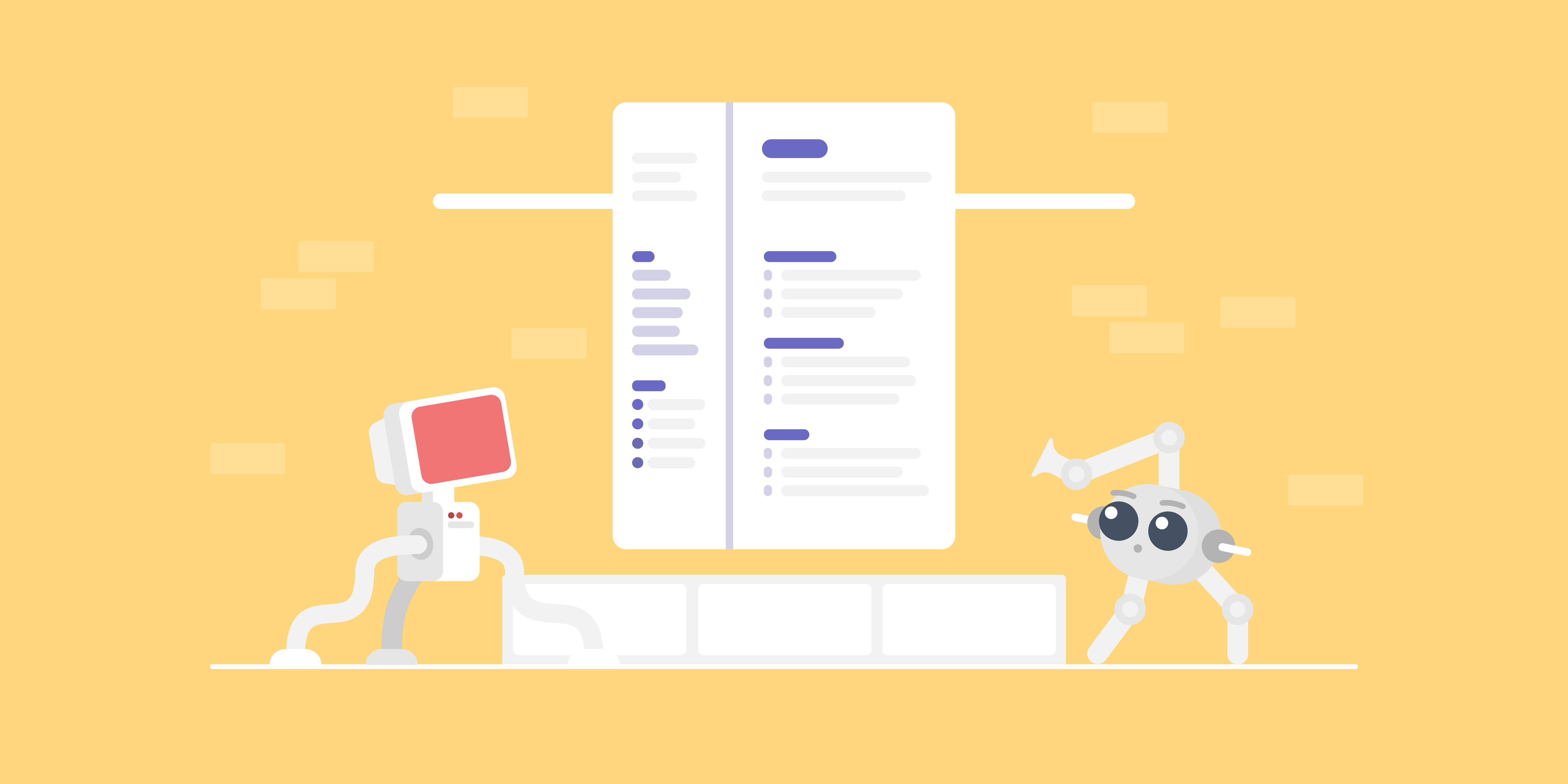
Want to create a great resume and impress the hiring manager? Use our professional resume builder to create your resume in minutes!
Choose a resume template to get started.
Why Visual Design Matters for Resume Success
Visual design isn't about making your resume "pretty" – it’s about making your qualifications impossible to miss.
Here's exactly why visual design makes or breaks your resume success.
#1. Design Influences First Impressions
Hiring managers need around six seconds to form an opinion about your resume. Before they get into details, they've already judged whether your resume looks professional or amateur.
A clean, attention-grabbing design signals competence and attention to detail. It tells employers you take your career seriously and understand professional standards. On the other hand, a cluttered or outdated layout raises immediate red flags about your commitment and professionalism.
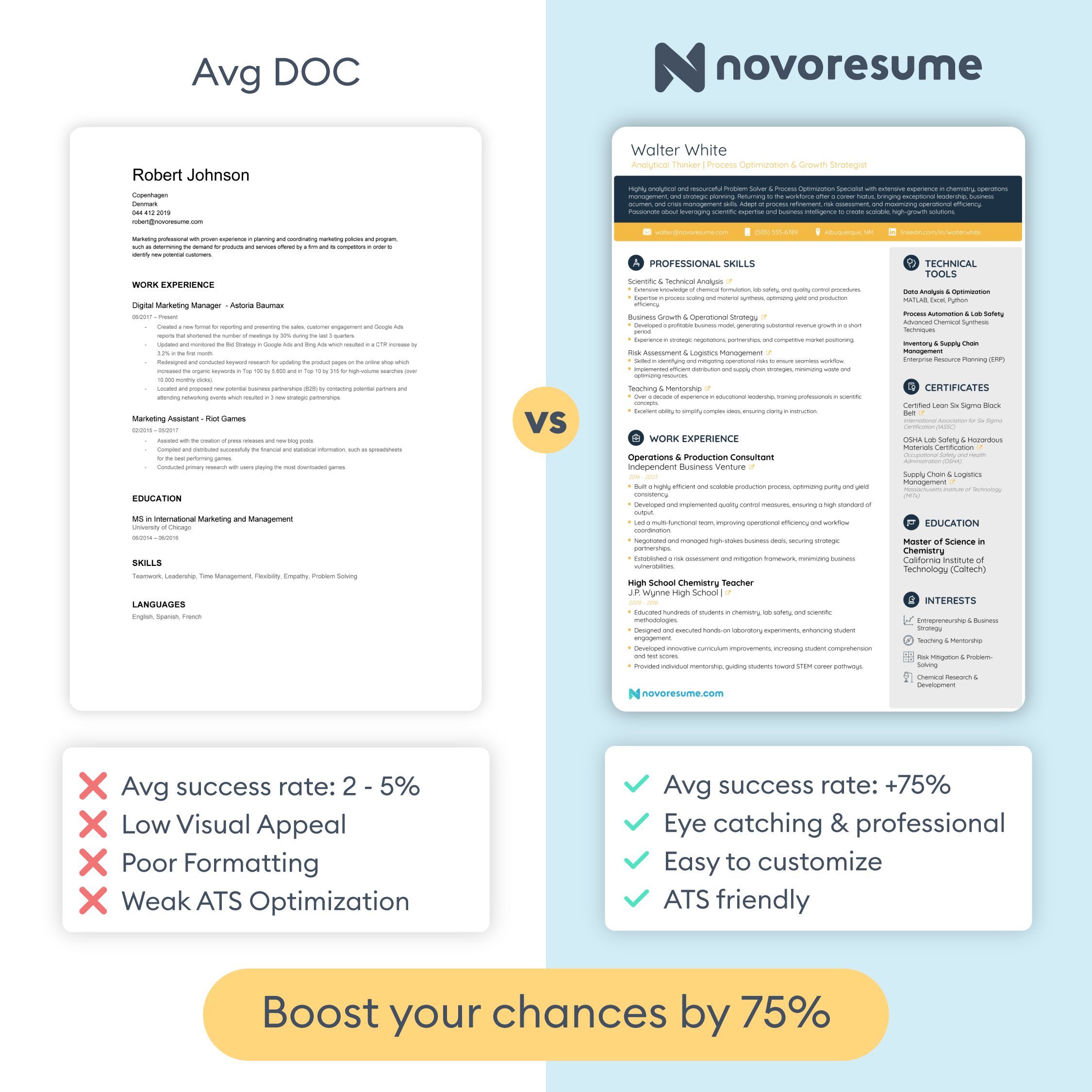
Using a resume builder ensures your design looks polished and professional from the start, without the guesswork of DIY formatting. See how Novorésumé templates compare to Word resumes:
#2. Visual Hierarchy Highlights Your Strengths
Visual hierarchy draws the reader's eyes to your top qualifications through strategic use of bold text, spacing, and placement.
Without a proper hierarchy, hiring managers will have to hunt for your achievements. They'll skim past your best accomplishments simply because nothing stands out. Most won't bother digging deeper.
Smart design puts your wins front and center. Larger headings for job titles, bold text for companies, and prominent placement of quantified data all work together to spotlight what matters most.
#3. Clean Design Helps ATS Scan Your Resume
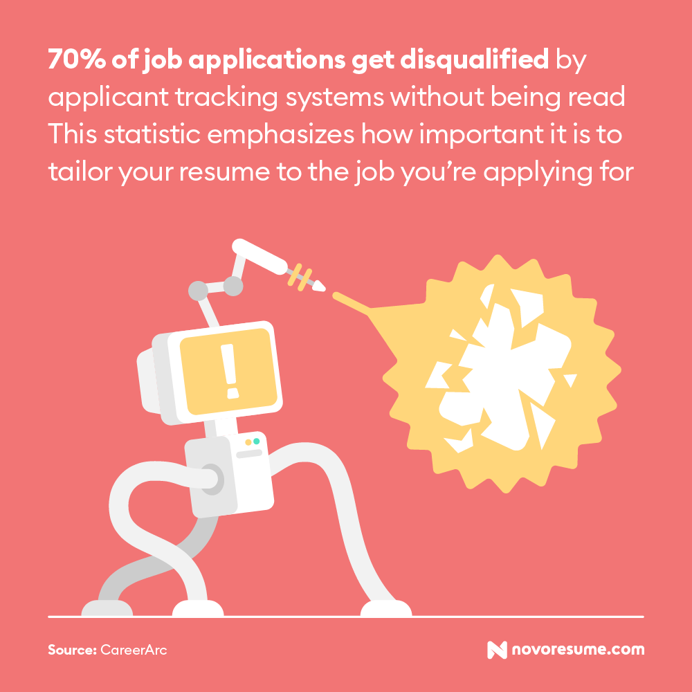
About 70% of resumes never reach human eyes because ATS (Applicant Tracking Systems) reject them first. Poor visual design is one of the top reasons resumes fail ATS screening.
ATS software parses your resume to extract information like job titles, skills, and dates. According to a 2024 academic study, these systems analyze your resume's text, visual elements, and layout simultaneously to convert it into structured data.
Complex designs with text boxes, tables, columns, and graphics confuse these systems. When the ATS can't read your resume properly, it either rejects you automatically or scrambles your information so badly that you look unqualified.
Clean, ATS-friendly designs use simple formatting that both robots and humans can read. Standard fonts, clear section headings, and straightforward layouts ensure your qualifications pass the initial screening.
#4. Visually Attractive Resumes Hold Attention Longer
The more reader-friendly your resume is visually, the easier it will be for hiring managers to focus on its content.
Poor readability comes from tiny fonts, cramped spacing, and long paragraphs. When text looks crowded or difficult to scan, the reader's eyes glaze over. They'll skim faster or skip sections entirely, missing your skills and best qualifications.
Readable design keeps them engaged long enough to see why you're the right candidate. White space between sections, adequate font sizes (10-12pt for body text), generous line spacing, and short, scannable bullet points all make your resume effortless to process.
The easier your resume is to read, the more information hiring managers actually absorb. And the more they absorb, the better your chances of landing an interview.
#5. Clear Layout and Formatting Reduce Cognitive Load
Inconsistent formatting shows you’re careless. When your bullet points don't align, your fonts change randomly, or your spacing is uneven, hiring managers notice and judge.
More importantly, they are likely to think that’s how you’ll perform professionally. If you can't maintain consistency on a one-page document about yourself, why would a hiring manager trust you with important projects?
A professional layout and formatting mean every element follows the same rules throughout your resume. All bullet points use the same symbol and indentation, all dates appear in the same format, and section headings use the same font size and style.
This consistency shows you pay attention to details and take pride in your work; these are exactly the qualities employers want in their employees. Besides, resume screening systems evaluate how well your sections connect and relate to each other, so breaking consistency disrupts their ability to understand your qualifications.
Make sure to double-check these formatting and layout elements:
Formatting checklist:
- Bullet point style and indentation
- Date formats (MM/YYYY vs. Month Year)
- Company name and job title placement
- Font sizes for headings vs. body text
- Spacing between sections
- Bold and italic usage
- Margins on all sides
- Line spacing throughout
#6. Visual Appearance Builds Your Personal Brand
Your resume is part of your personal brand. When its design is a cohesive part of your professional portfolio, you create a memorable professional identity that hiring managers can’t ignore.
Consistent branding shows intentionality. It signals that you're strategic about your career and understand how to professionally present yourself across different platforms. Hiring managers notice when candidates have clearly thought through their professional image.
This doesn't mean you should fill your resume with fancy graphics or colors. Simple consistency works best: using the same color scheme for headings, matching your font choices, or maintaining a similar visual style across your materials.
When a hiring manager sees your resume, then visits your LinkedIn profile and finds a matching professional headshot and similar formatting, it reinforces your credibility.
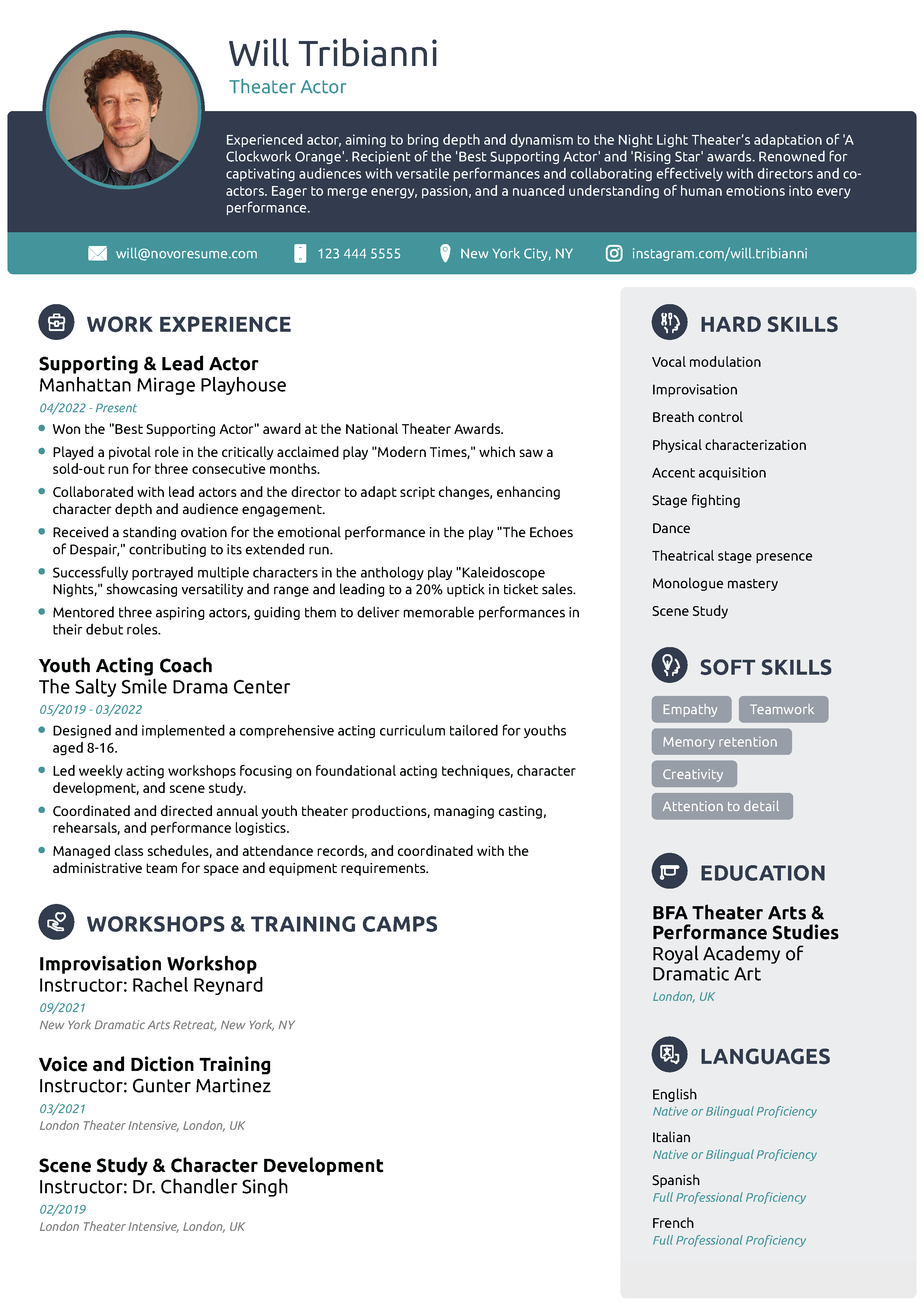
What Good Resume Design Actually Looks Like
A well-designed resume balances visual appeal with functionality; it looks professional while making your qualifications easy to find and read.
Good resume design isn't flashy or creative for the sake of standing out. It's strategic, clean, and purposeful. Every design choice serves a function: guiding the hiring manager's eye, emphasizing achievements, and creating a smooth reading experience.
Here's what a properly designed resume looks like in practice:
5 Common Visual Mistakes That Hurt Your Resume
Even qualified candidates get rejected because of simple design mistakes. These errors make hiring managers work harder to find your qualifications, and when they're reviewing dozens of applications, they simply won't bother.
Here are the most common resume mistakes that kill your chances:
- Tiny or oversized fonts. Using text smaller than 10pt strains eyes, while anything larger than 12pt looks amateurish and wastes space.
- Zero white space. Cluttered resumes overwhelm eyes and make it nearly impossible to find key information.
- Graphics and icons. These break ATS parsing and add zero value to your qualifications.
- Walls of text. Dense paragraphs are the exact opposite of reader-friendly.
- Inconsistent formatting. Random spacing, misaligned elements, and mixed date formats look sloppy and signal poor attention to detail.
Key Takeaways
And that's a wrap!
Before you go, let's quickly recap the most important points:
- Visual design determines whether hiring managers read your resume or skip it in the first six seconds. A clean, professional layout signals competence before they read a single word.
- Strategic visual hierarchy guides recruiters straight to your strongest qualifications through smart use of bold text, spacing, and section placement.
- ATS-friendly design is non-negotiable since 70% of resumes get rejected by automated systems. Simple formatting with standard fonts and clear sections ensures both robots and humans can read your resume.
- Readable design keeps hiring managers engaged longer. Proper font sizes (10-12pt), white space, and short bullet points make your qualifications easy to absorb.
- Consistent formatting throughout your resume signals attention to detail. Every bullet point, date format, and heading should follow the same rules.
- Your resume design should align with your LinkedIn profile and other career materials to build a cohesive personal brand.
- Common design mistakes like tiny fonts, zero white space, graphics, and dense paragraphs are all fixable in minutes—but most candidates don't know to look for them.
Related posts

Resume & CV Writing Tips
Learn the ins and outs of writing the perfect resume with our complete guide! Check out expert tips, real-life examples, and more!

Resume & CV Writing Tips
Read 60+ statistics on how Americans write, customize, and submit resumes today, and what it means for job seekers.

Resume & CV Writing Tips
Novoresume surveyed 914 job seekers about their results. 77% of those hired say the platform helped them land the job, and 79% received an offer within 3 months. Full data inside.